Webflow Development · 2025
Dite
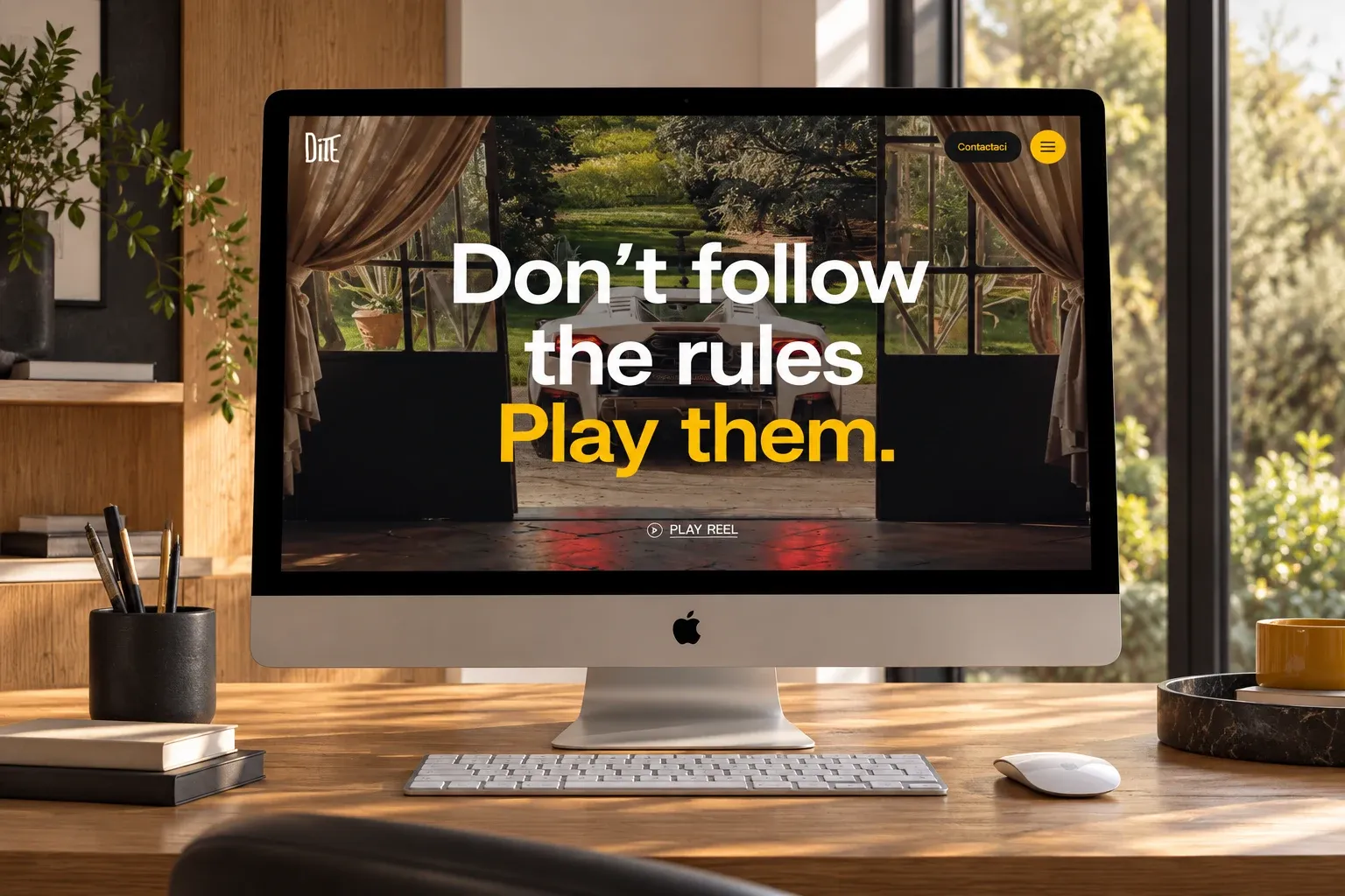
Webflow development of a creative agency’s website, with GSAP animations and technical SEO.
Accessibility
Adjust the site to how you read best. Your choices stay saved in this browser.
Ceres
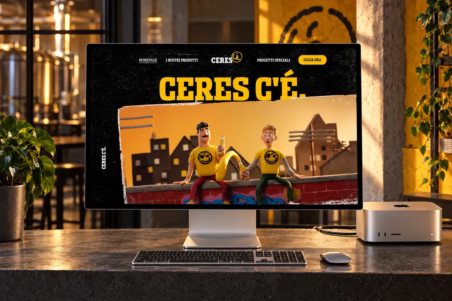
Interface design for the new Ceres website, together with We Are Social.
Ceres is a beer brand known in Italy for its ironic, straight-talking communication. The new website had to sound like the campaigns: “Ceres c’è. Il sito pure.” (“Ceres is here. So is the website.”) To design it, We Are Social brought me in on the interface.
I worked as a UX/UI designer alongside the We Are Social team: page structure, components and interface design, up to the prototype handed over to development.
The website is built around three simple paths: the products, the special projects and the game, always within reach in the menu. The brand’s ironic tone comes through in the visuals: huge yellow headings on black, torn-poster textures, images that look pasted onto the page.
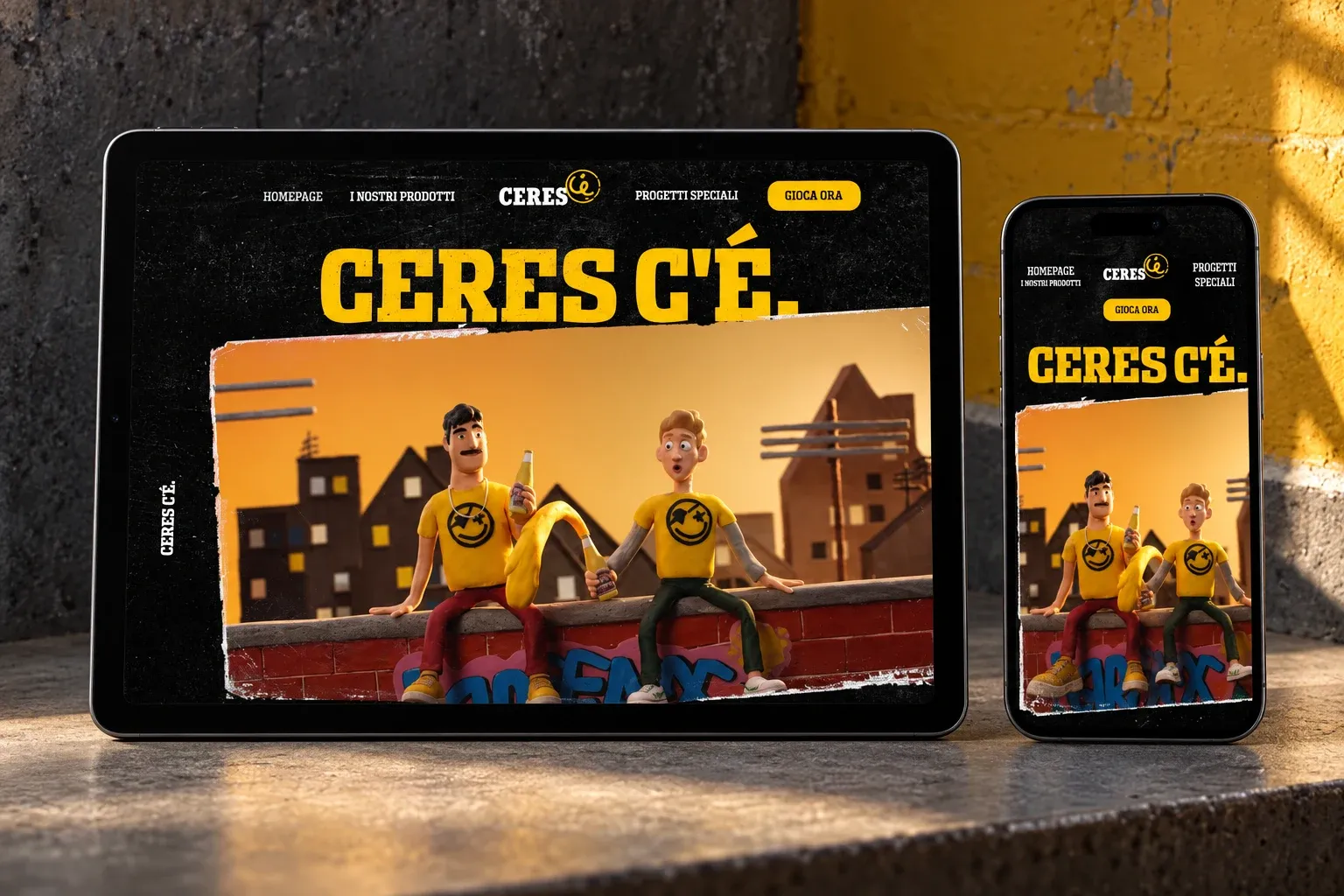
I designed each section as a reusable component, with its own desktop and smartphone variants, so the development team could put pages together without reinventing them every time.
I thought about GEO and AEO at the design stage too: a clear heading hierarchy and copy that immediately answers what visitors are looking for (“se cercavi Ceres la birra, l’hai trovata”, “if you were looking for Ceres the beer, you’ve found it”) make the website easier for Google and answer engines to understand.
A website you recognise at first glance, with the same personality as the Ceres campaigns and a simple structure to navigate, on smartphone and desktop alike.
Webflow Development · 2025
Webflow development of a creative agency’s website, with GSAP animations and technical SEO.
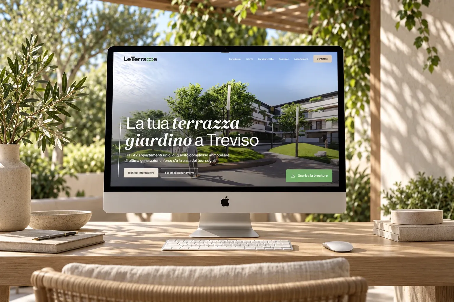
UX/UI Design, Webflow Development · 2024
Website for a new residential complex, from UX/UI design to Webflow development.
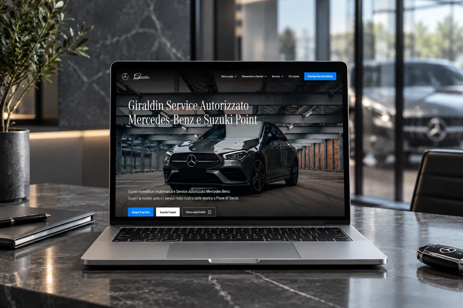
UX/UI Design, Webflow Development · 2024
Website for a car dealership and garage, from UX/UI design to Webflow development.
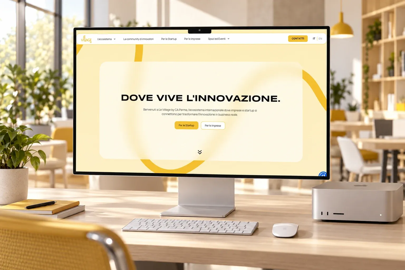
Webflow Development · 2026
Webflow development, in Italian and English, and technical SEO for the website of the innovation hub Le Village by Crédit Agricole Parma.
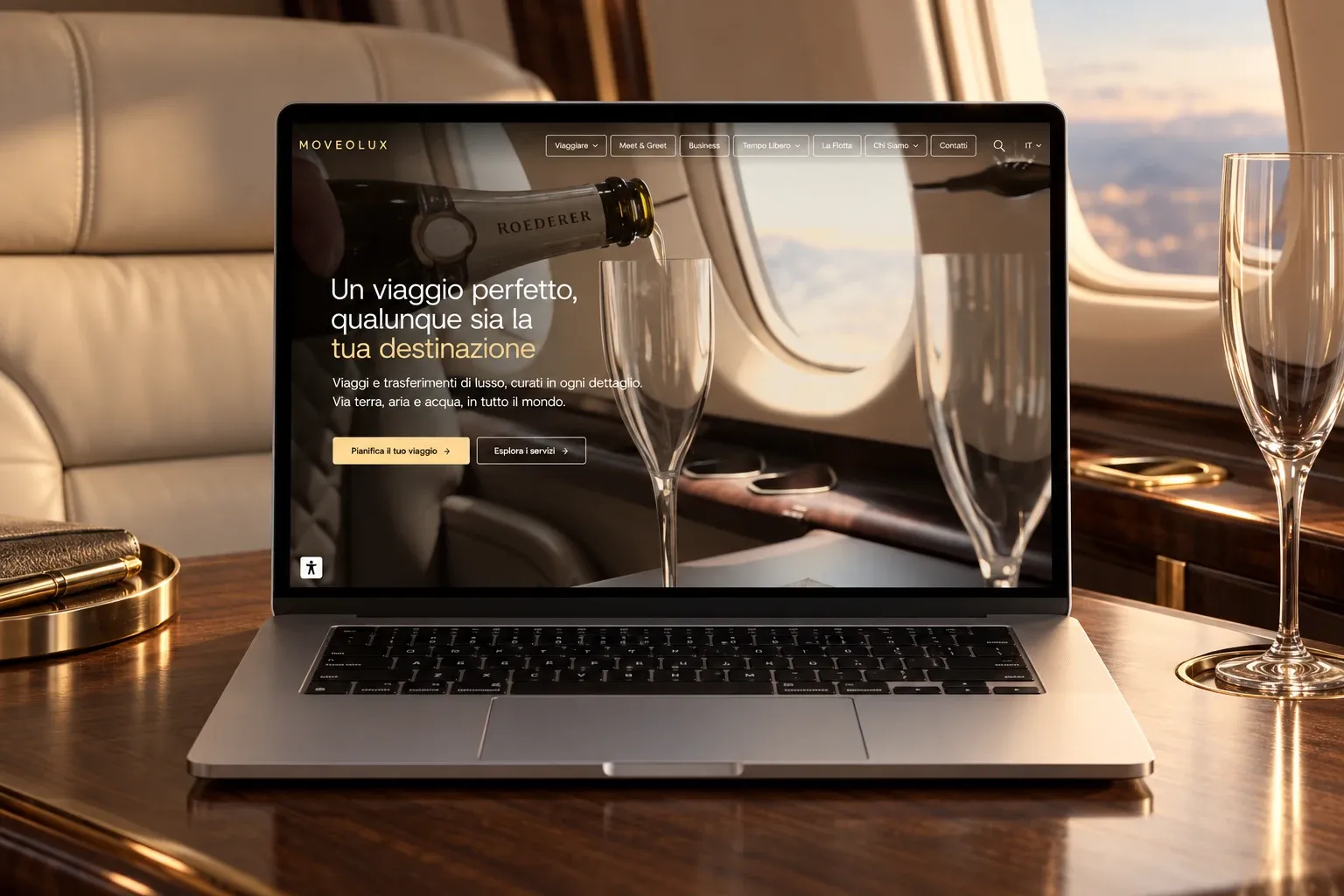
Webflow Development · 2026
Redesign of a luxury travel agency’s website, with Webflow development and full SEO, GEO and AEO work.
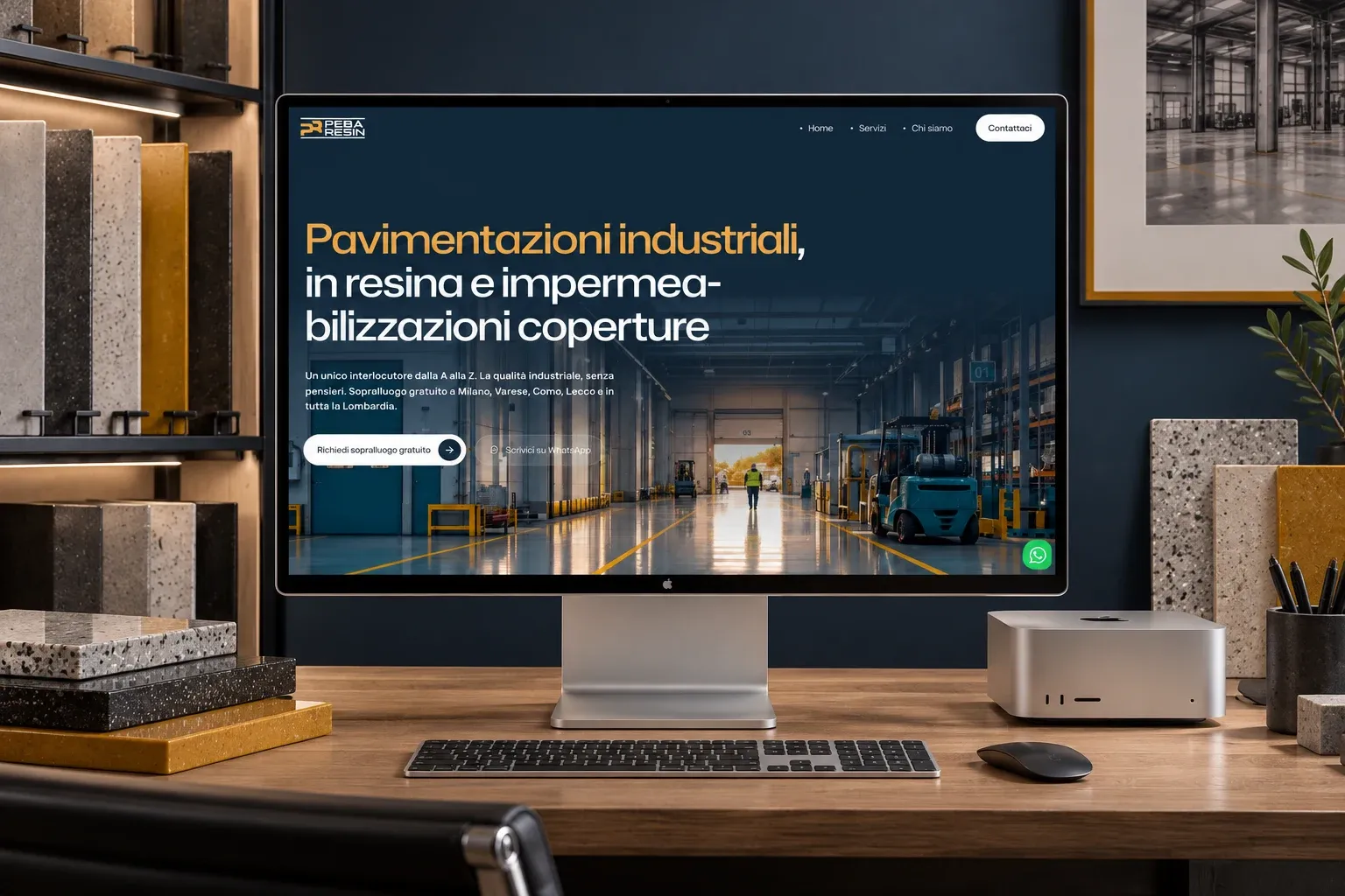
Web Design, UX/UI Design, Visual Design · 2026
Logo, custom design and development of the website for an industrial resin flooring company, with local SEO for Lombardy.
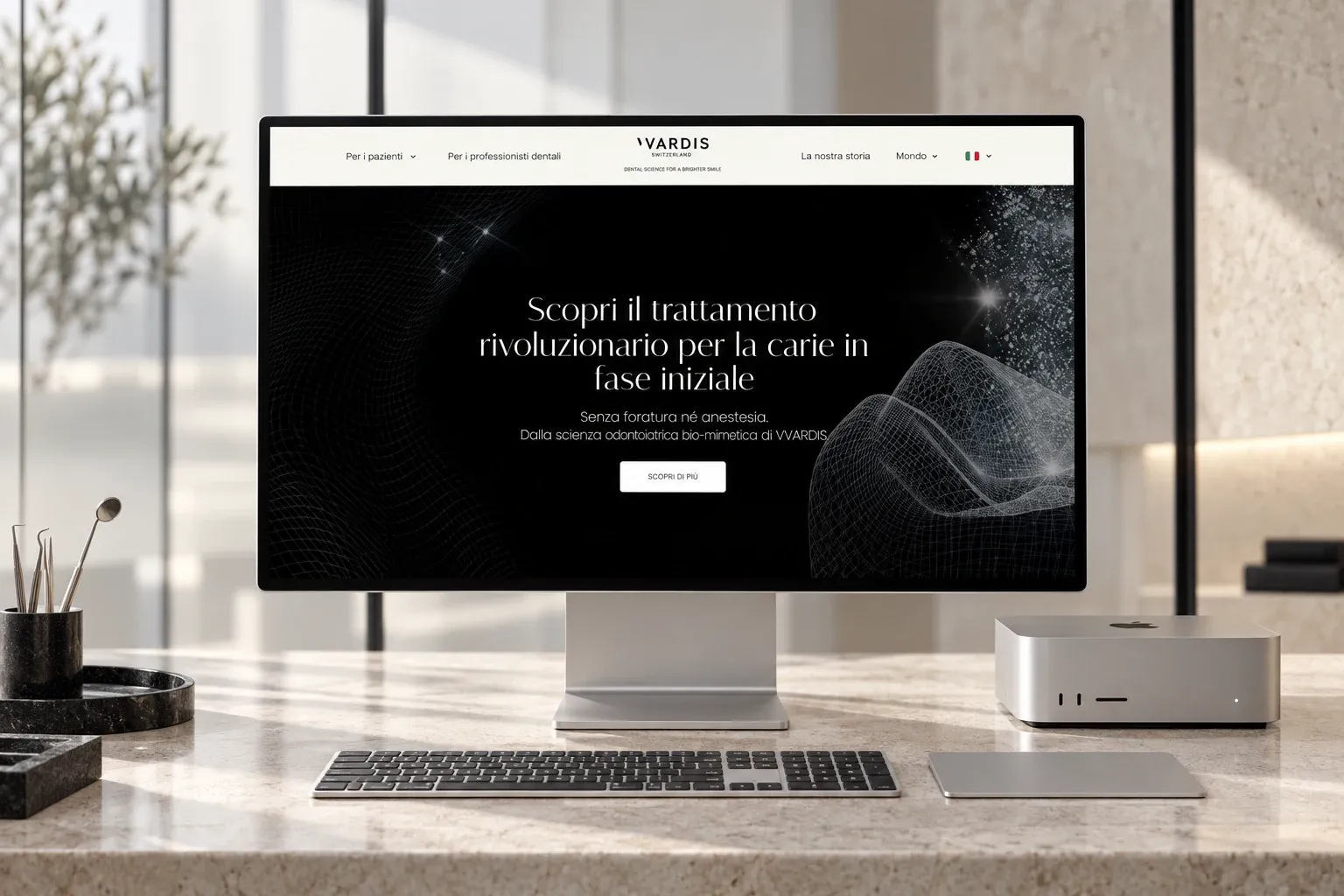
Webflow Development · 2026
WordPress to Webflow migration of the website for vVardis, a Swiss dental care company, in seven locales.
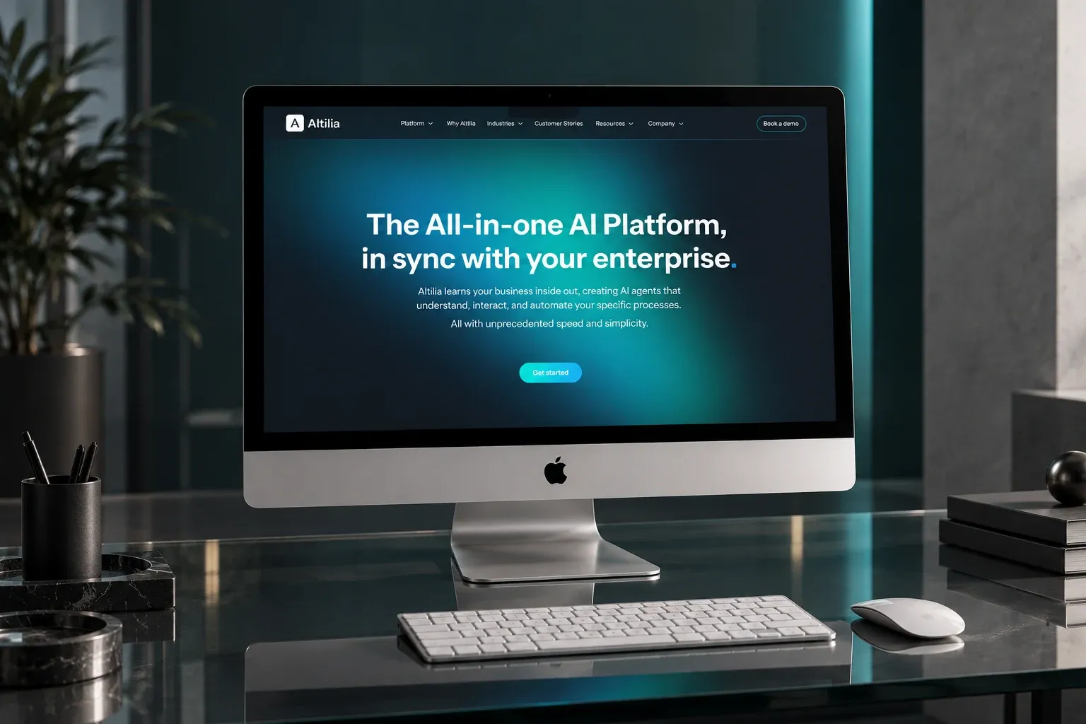
Webflow Development · 2025
Webflow development, with design support, for the website of Altilia, an artificial intelligence platform for businesses.
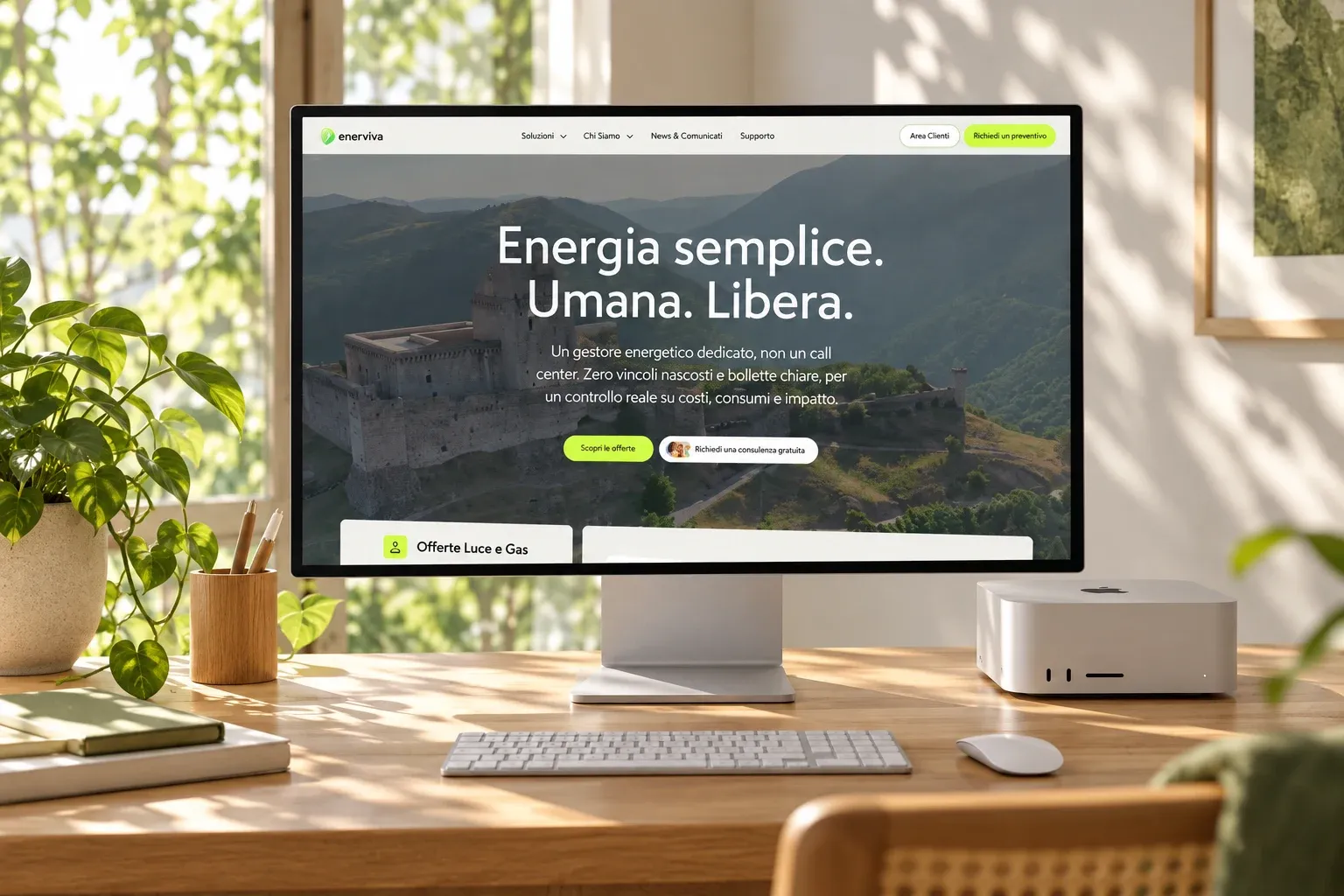
Web Design, UX/UI Design, Webflow Development · 2025
UX/UI design, Webflow development and SEO for the website of an energy supplier for professionals, businesses and households.
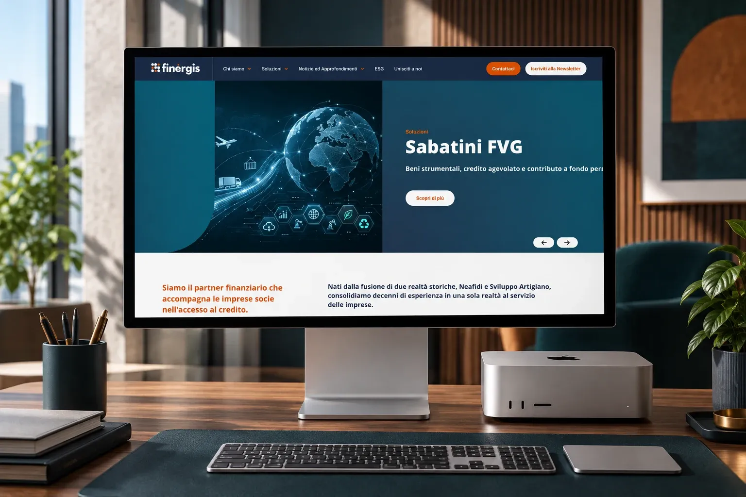
Webflow Development · 2025
Webflow development, with design support, for the website of Finergis, a financial partner helping businesses access credit.
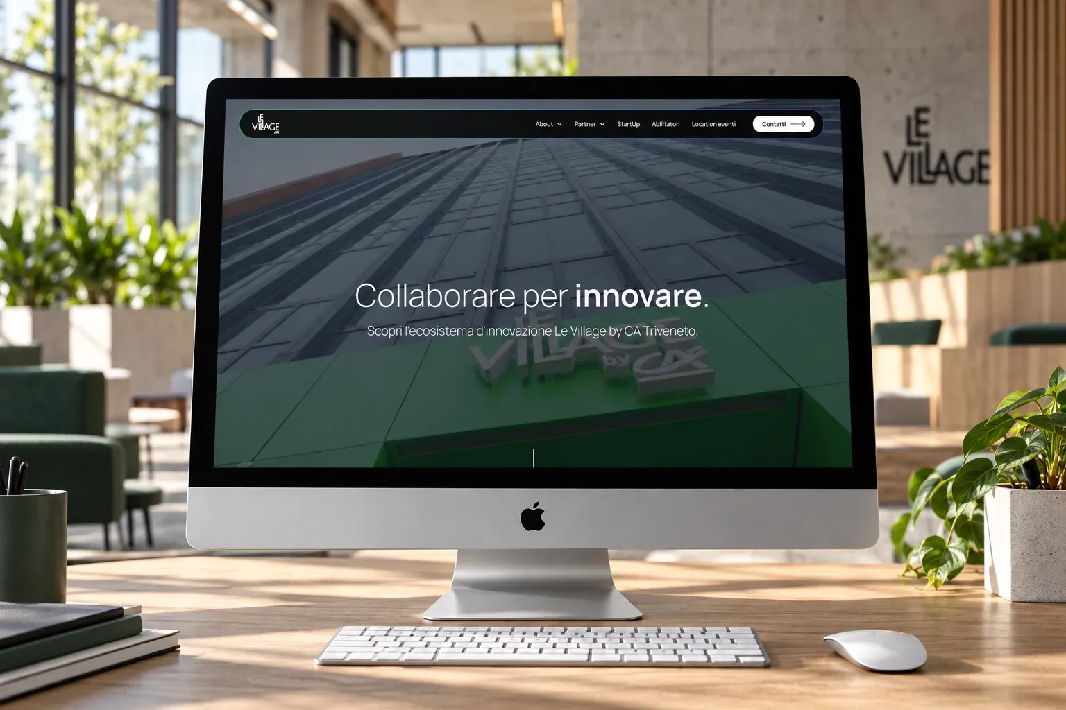
Webflow Development · 2025
Webflow development and technical SEO for the website of Le Village by Crédit Agricole Triveneto, the innovation hub in Padua.
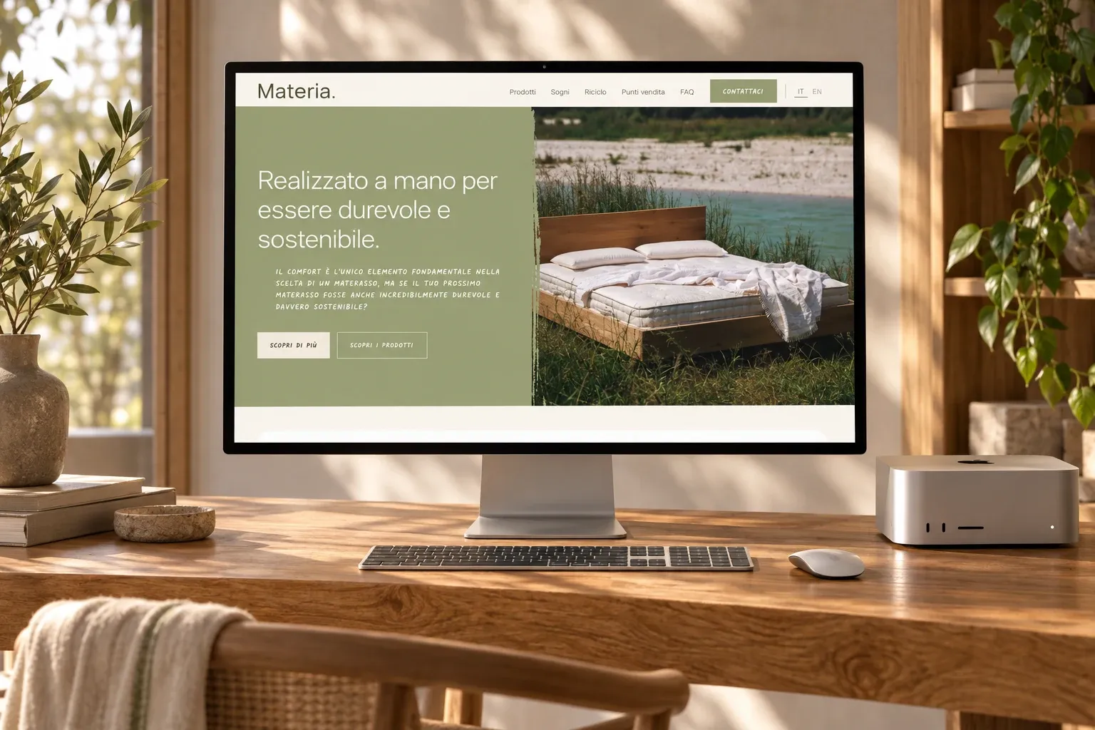
Webflow Development · 2025
Webflow development, in Italian and English, of the website for Materia: handmade, recyclable mattresses by Brentaflex.
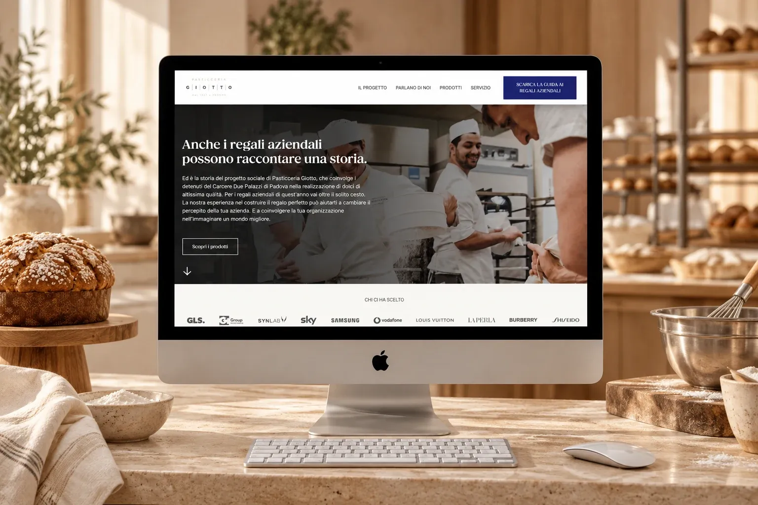
Webflow Development · 2025
Webflow development of the landing page for Pasticceria Giotto’s charitable corporate gifts, the project that brings pastry making into Padua’s prison.
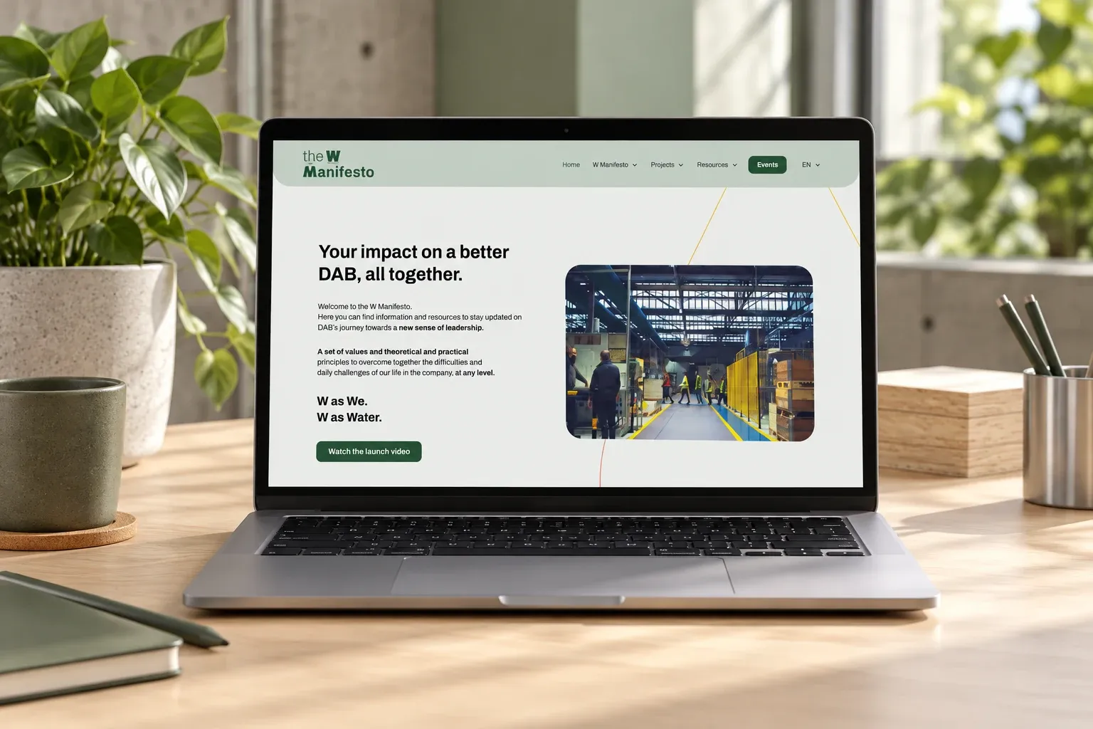
Webflow Development · 2024
Webflow development, in four languages, of the internal communication website for DAB Pumps.
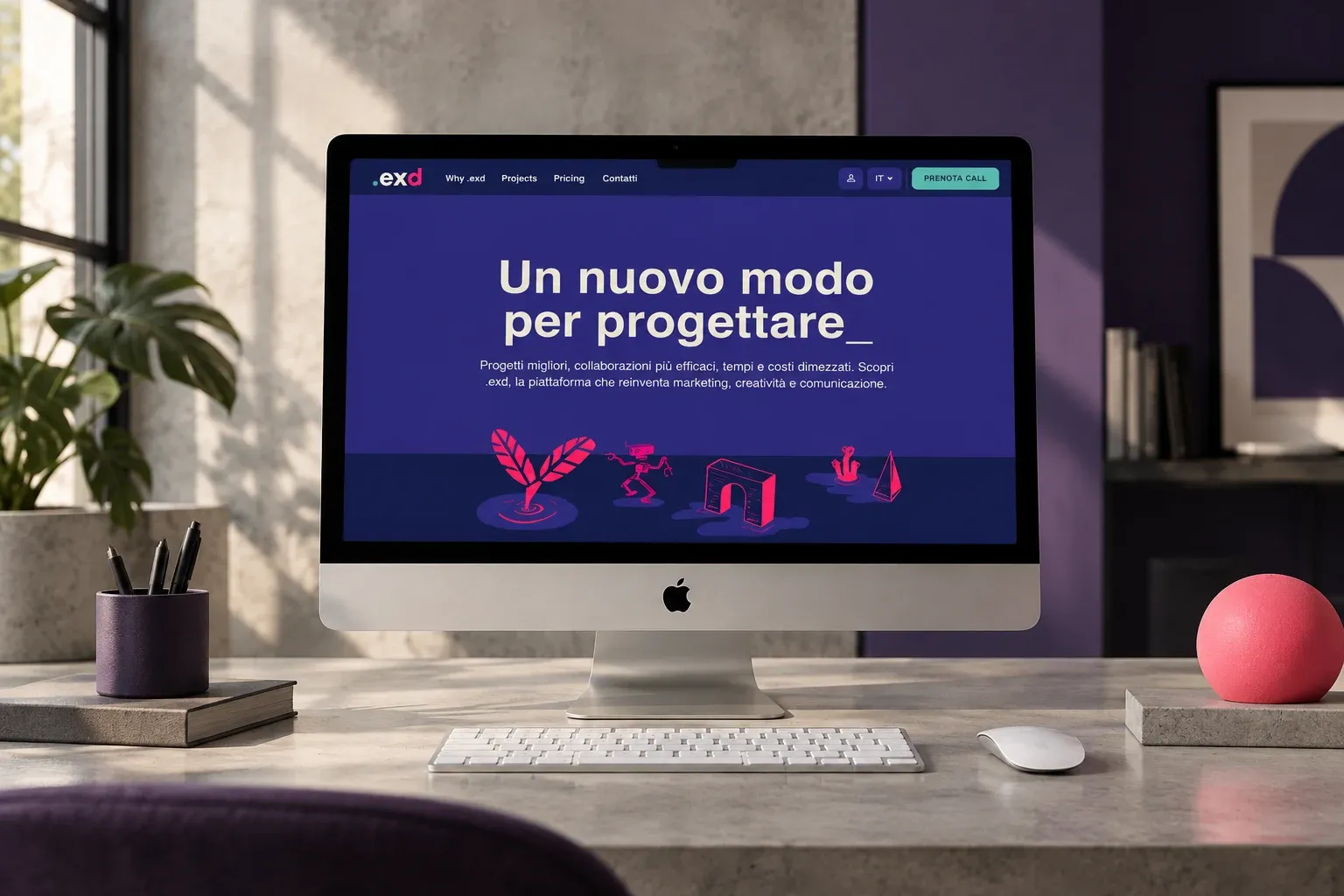
Webflow Development · 2024
Webflow development, in Italian and English, of the website of .exd, an ecosystem of freelance marketing and communication talent.
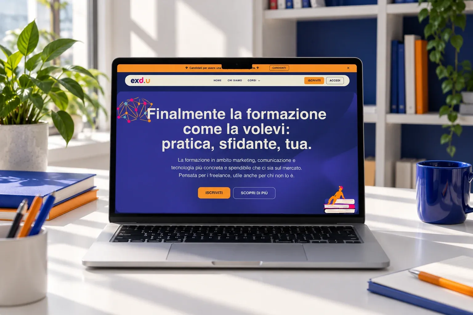
Webflow Development · 2024
Webflow development, with design support, for the website of exd.u, .exd’s training project for marketing, communication and tech freelancers.
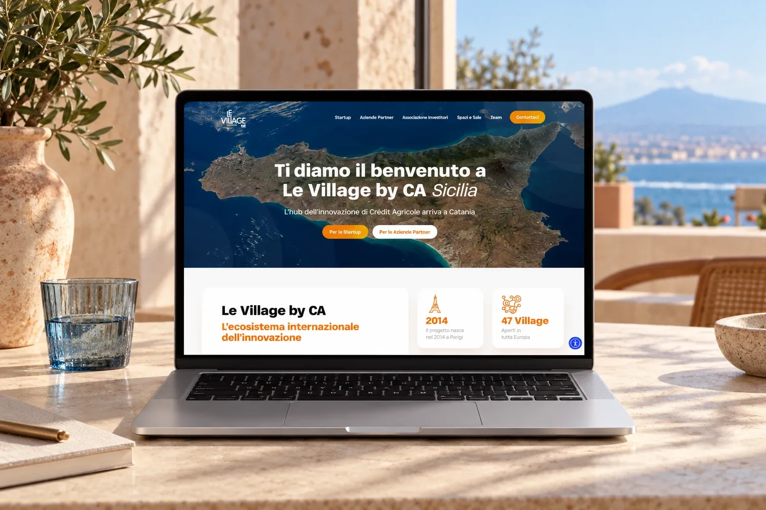
WordPress Development · 2024
WordPress development, with design support, for the website of the innovation hub Le Village by Crédit Agricole Sicilia.
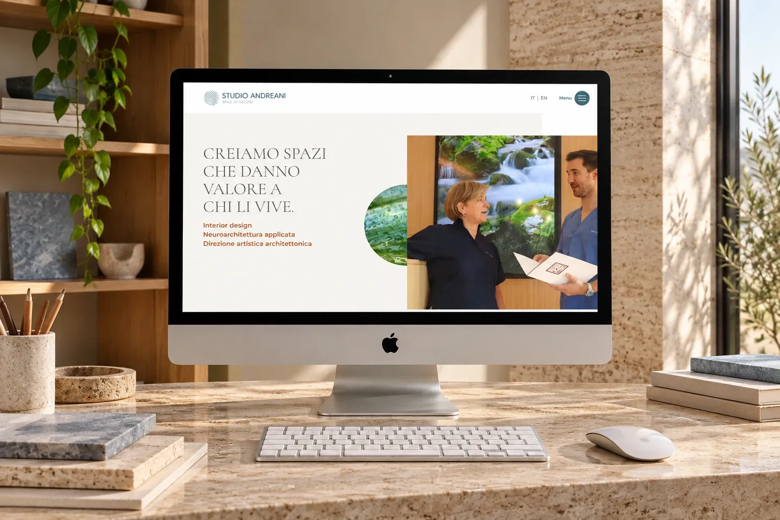
Webflow Development · 2024
Webflow development, CMS, animations and technical SEO for the website of an interior design and neuroarchitecture studio.
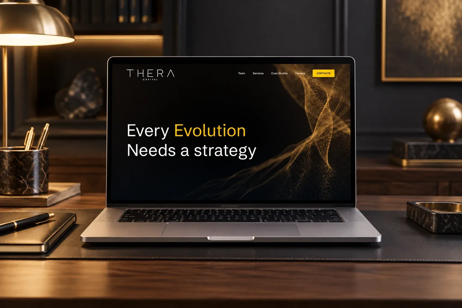
Webflow Development · 2024
Webflow development, in Italian and English, with design support, of the website for Thera Capital, a strategic corporate finance firm.
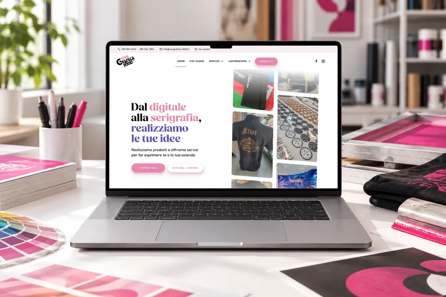
Web Design · 2023
Design and Webflow development of the website for a screen printing, print and graphics studio in the province of Venice.
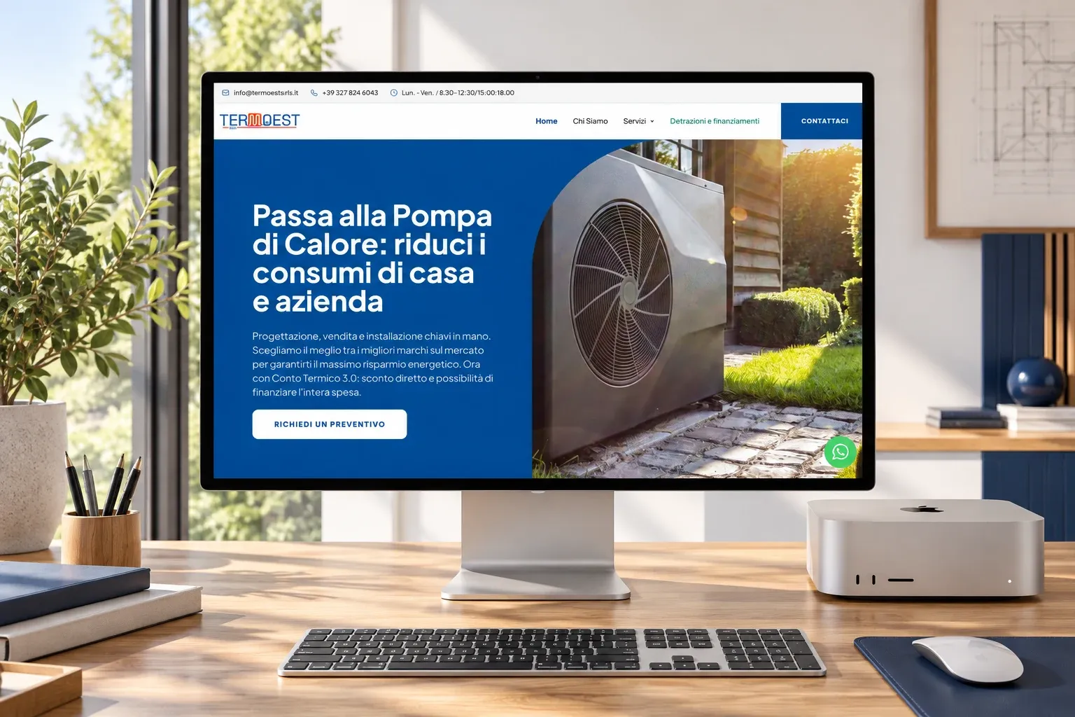
Web Design, Visual Design · 2023
Logo, design and Webflow development of the website for a heat pump, solar PV and air conditioning company.
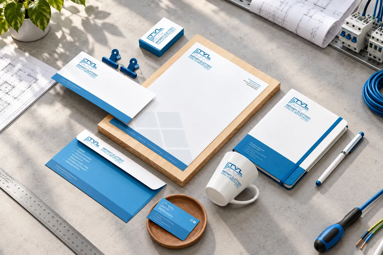
Visual Design · 2022
Logo and corporate identity for an electrical installation company.